Lolzteam
Lolzteam is a project where we developed two logos that align with the overall brand ecosystem. The main task was to visually maintain stylistic consistency while preserving the edgy and technological character of the logos, seamlessly integrating them into the Lolzteam identity.
Go back
Objective
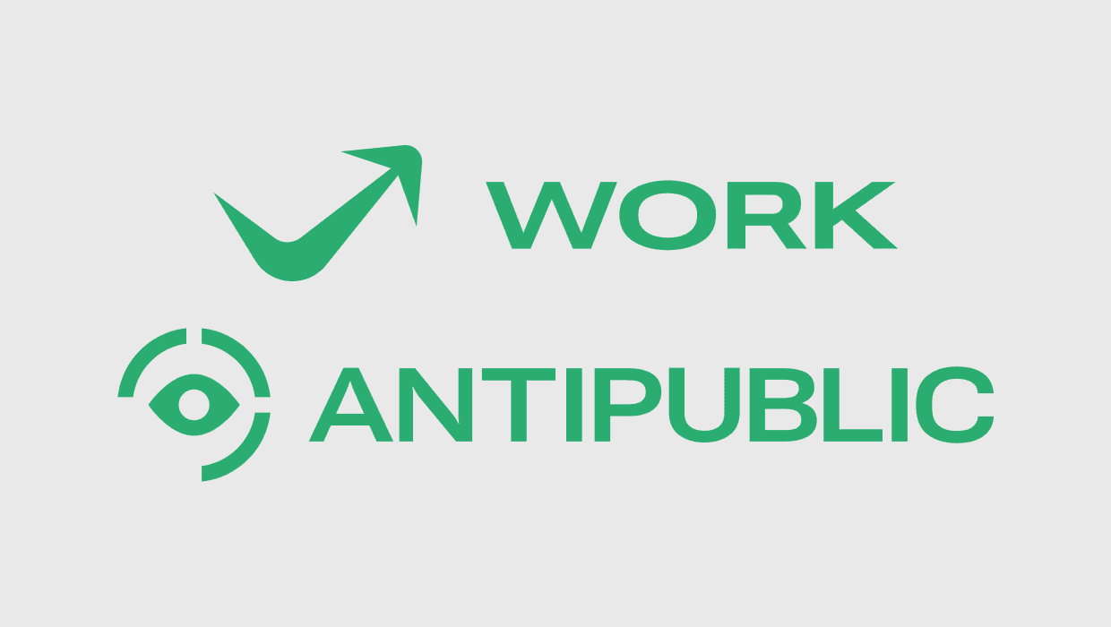
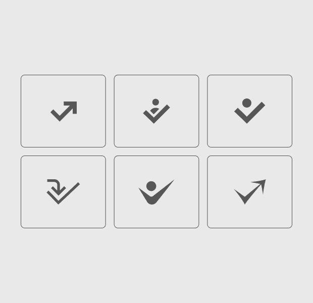
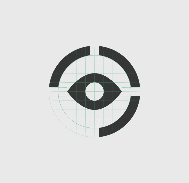
We started with a mood board and an association map to define key words: “accessibility,” “efficiency,” and “speed.” This helped set the right tone for the logos and emphasize the brand’s bold character. One logo uses sharp angles and observation symbolism, highlighting privacy and security, while the other features an arrow and a checkmark, reflecting task completion and results.

Solution
Each variant went through several stages of refinement, from sketches and 3D concepts to final vector solutions. This approach not only ensured a consistent style but also highlighted the uniqueness of each logo within the brand’s framework.