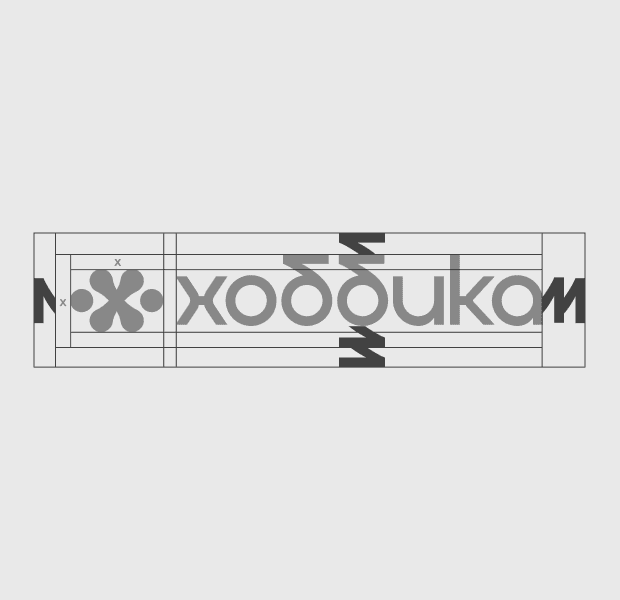
Hobbyka
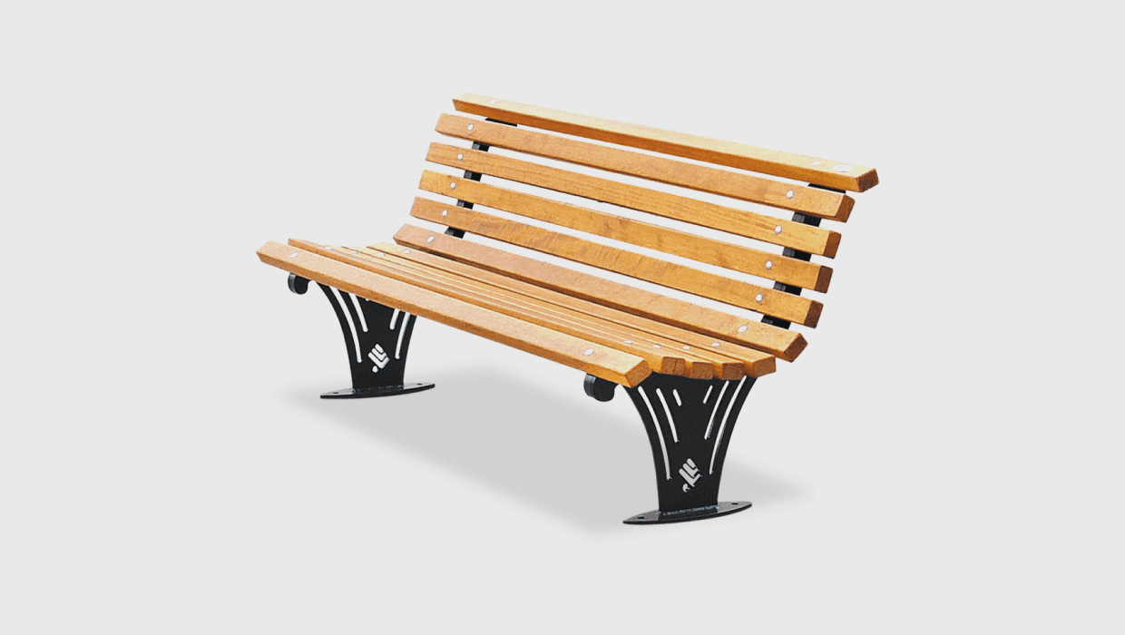
Hobbyka is a leading manufacturer of equipment for the improvement of cities and parks. As part of the rebranding, we created a new logo and identity, and also assembled a comprehensive brand book with 42 slides, which became the foundation of the company’s visual communication.
Go back
Objective
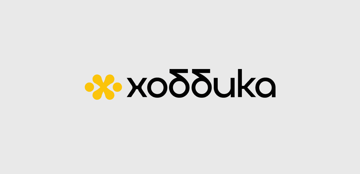
The inspiration came from fastening elements and the symbolism of reliability: the logo is designed in the shape of the letter “X,” which incorporates images of bolts and cotter pins. This symbol conveys the idea of strength, stability, and the high quality of the products. The color palette is based on the contrast of bright yellow and solid black, reflecting the brand’s energy and its premium status.

Solution
We started with pencil sketches and carefully refined each element before transferring the logo to vector and developing the entire corporate style: from patterns and business cards to flags and web elements. This approach made it possible to create a complete identity that easily scales and looks equally confident in both digital and offline environments. As part of the brand book, we also prepared two website design concepts, which formed the basis for the redesign of the company’s main website.